Day One On The Job With MGP 1.6.10 and MetaServer 5.3.0

I’ve finished a 14-hour work day on a Mac using Cubase 14.0.32 and Pro Tools 2025.6.1 that started with me installing both MGP 1.6.10 and MetaServer 5.3.0.

Overall, it’s been good. Haven’t had any connection problems with multiple iPads. That was the biggest issue for me and I had ZERO hiccups through the entire day. App response overall seems snappier and I dig the new Presets setup. The Settings window continues to get friendlier. I had some issues with the wrong primary grid coming up in various apps right after the install, so I did a new install and restore and that seemed to fix it.

The good:
Undo works WAY better! This is a very big deal.
Import/export any element! Woo hoo!
Grid imports show up fully before installing
Overall response is noticeably quicker, including with Dynamic Focus
There are extra options for getting around between grids that are very helpful.

The not-so-good:
Other than the first thing here, most of this is nitpicky stuff, not overreaching issues:
Exporting and importing is now a 5-dialog process, which gets pretty annoying. It’s more stable, but are all those extra steps necessary? Can they be adjusted? Maybe have dialogs appear when something goes wrong and not have to confirm every step if things go okay. Or not have the naming option come up every single time.
Disable Hot Corners still doesn’t stay disabled.
If you try to use a calculator app of any kind other than the Apple calculator, MGP prompts you repeatedly to try the Apple Calculator preset. Even if you choose “Skip,” the prompt keeps popping up.
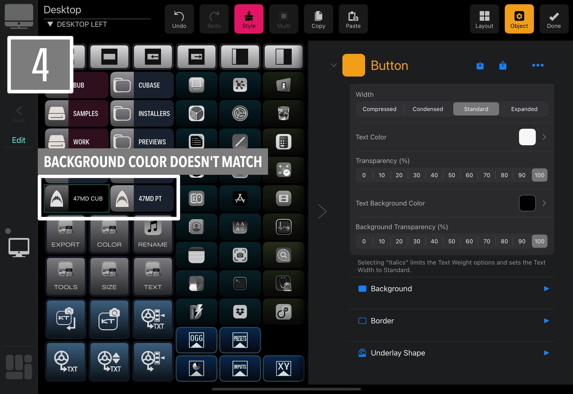
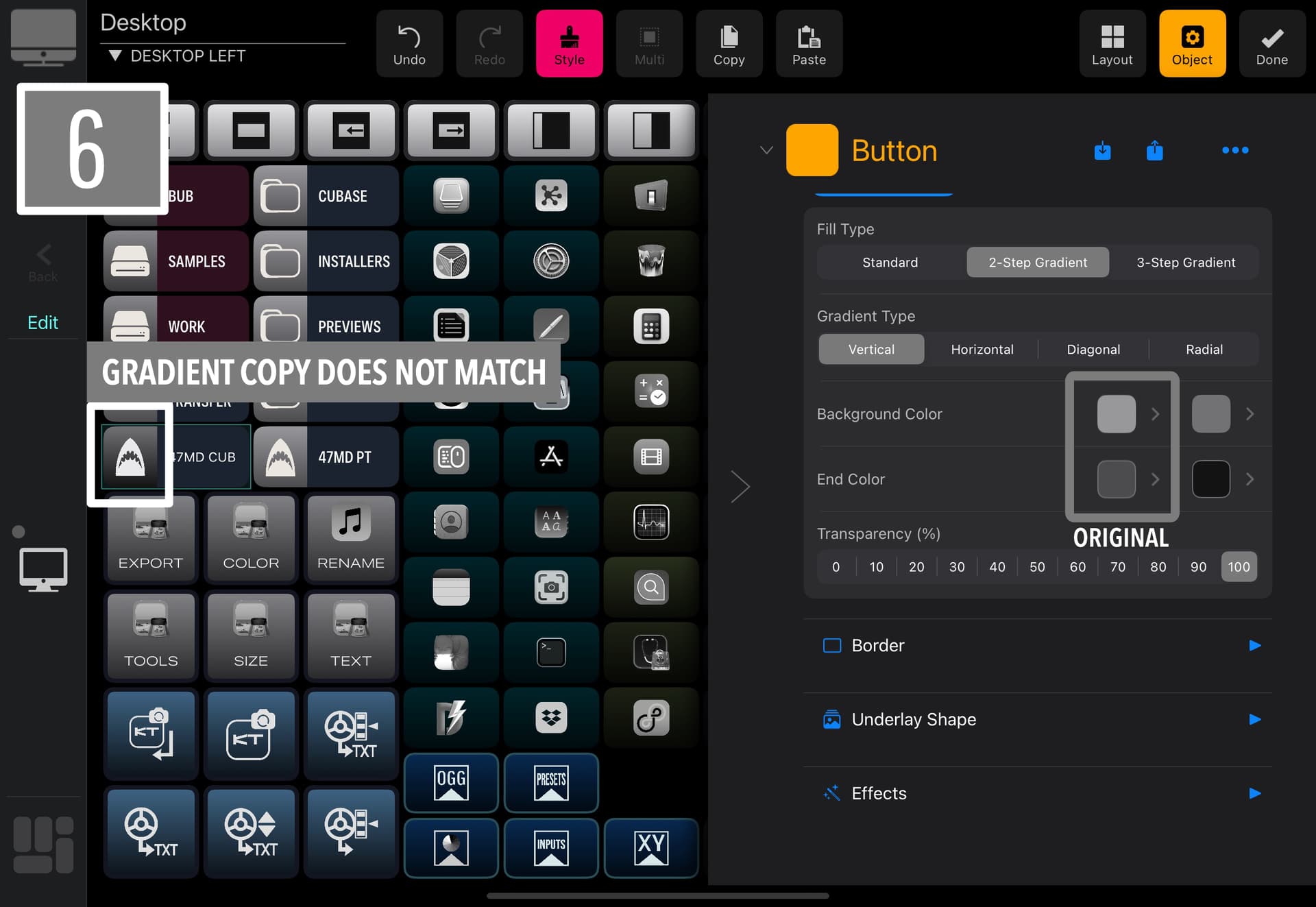
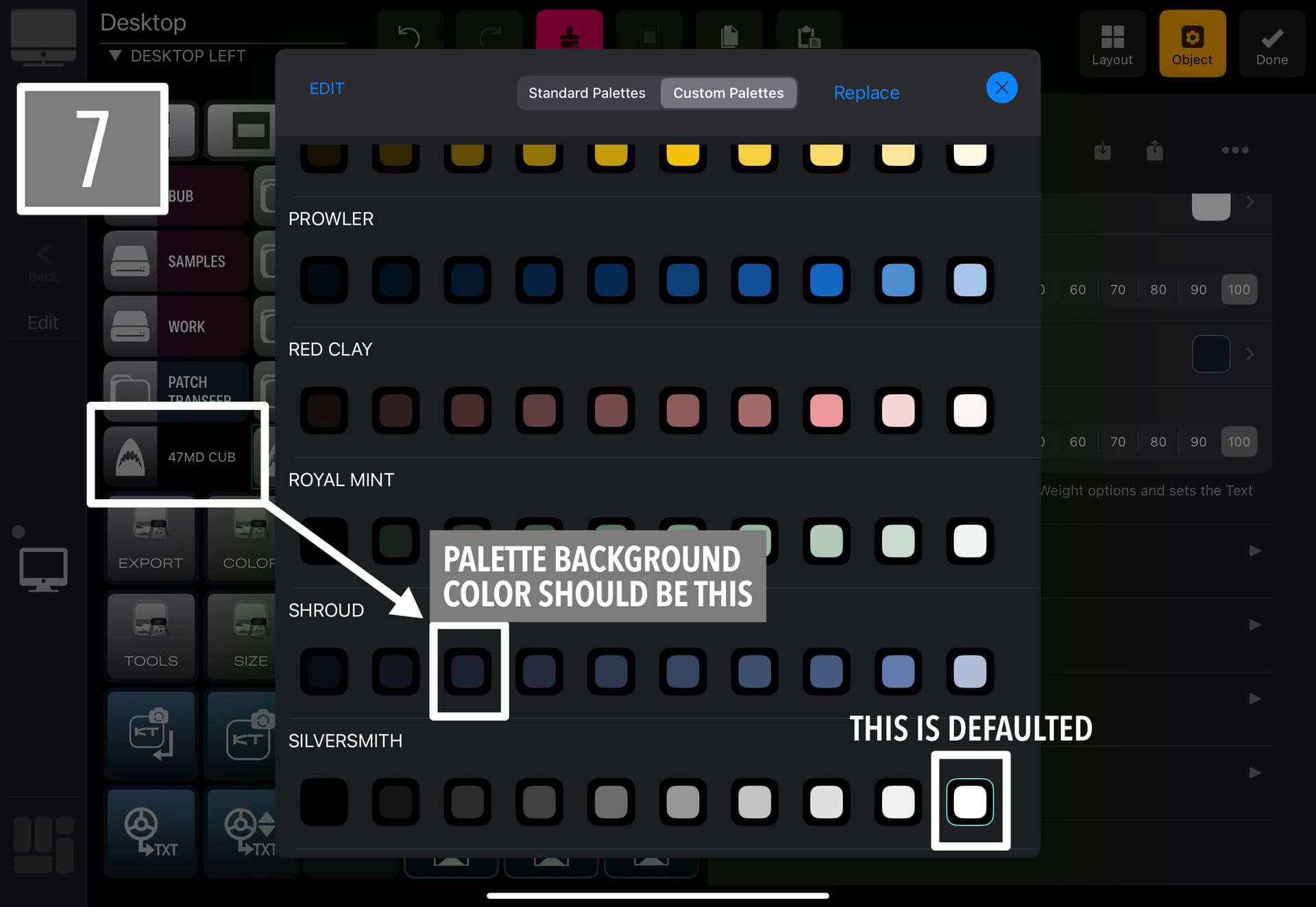
Button properties do not copy reliably. Not a single button copy/pasted correctly onto another today. Parameters were ignored and color choices don’t reference back to what’s chosen in the Palettes.
Why all the tags in the Style menu?? They just eat up space that doesn’t need eating up. The checkmarks worked great on their own. This particular menu seems to be growing for no real reason over the last couple versions.
There’s still no way to name a button something other than what the text field happens to be for that button. This is problematic when you have two locations or functions that basically do the same thing, but for different apps, or you have a long macro description, but the button won’t accommodate all that text.

The only crazy thing I wish for is an export all buttons function. Some of my grids have 75+ buttons on them. Doing any sort of bulk design change is super tedious because moving grids around and copy/pasting buttons is actually a lot more challenging than just downloading from a central button collection.

All that said, I’m happy. All three iPads worked happily away all day and didn’t cause any sort slowdown or work stop. That’s the primary goal in my book.

Glad to hear it.

Glad these things are noticeable - we have rewritten core systems for grid switching, states management etc. - that should have a big impact on the performance - at least from the metrics we are getting here and our usage patterns.

Now, let’s have a look at the issues:

OK, we will think how to improve it - open for discussion and improvements suggestion.

OK, reinvestigating - the fix should go in 1.6.11

OK, that’s a big one - reinvestigating the logic and the fix will go in 1.6.11

We have tested this to death on our test systems - please share a couple of buttons you have issues with and we will do the testing cycle again.

That was based on user feedback for better indications what is being copied - quite often the parameters need to be scrolled to see what you are copying. But we will think how to improve this - definitely your opinion matters.

I need more info on this - you can rename the button name during the export.

Added to the FR list.

:black_heart:

You know what? You’re right!

It didn’t occur to me that the rename function solves the button name problem. DUH! My bad. Goes to show how when you get focused on one process you miss the solution sitting right in front of you in the other. Make sure to slap me on the forehead and say “Pay attention!” next time you see me.

The dialog thing, I think, has a simple solution. Pro Tools used to have a similar process with certain functions and Avid solved it using two different methods. 1. For some confirmations, they switched to only having a dialog pop-up if something went wrong. If the operation was good, no dialog. 2. On something like fades, exports or Commit they added a “default” dialog that you can set up once and that becomes de facto for the user. You can go back and change it at any time. Honestly, I think it boils down to the fact that MGP is getting so deep and multi-faceted that you might have to consider a more in-depth Settings page to cover a variety of operations and corral some preferences that are currently spread throughout the app.

It seems like export destination could be a settings thing? Do people change their export destination often enough to warrant making that decision with every export? I don’t have that data, so I don’t want to say this or that is the way. It’s an observation.

If the tags were a user feedback thing, then they should be there. Maybe just make them smaller? Or have a row of squares at the top of the page, one for each section, and if something is chosen in that section, the square lights up? Or do like NI did, and make the tags view collapsible? I remember in the Komplete 2 browser that tags got so plentiful that when you searched, all you could see were tags and no results!

Regarding the Calculator. The two other apps I’m using are Timecode Calculator

and Time Calculator (Work Hours).

Both are available in the App Store.

Here’s a button copy example. I figured screenshots would show the issue far better than I can explain it:

The other thing I forgot to ask about is what about user backgrounds? Even if it was just changing solid colors. Is it possible to make those, just like icons?

Thanks! This app is getting supercharged. It’s awesome.

M.

OK, with copy/paste style - you need to select the state as well - otherwise no other paramters will be copied - you have it written in red.

These should be different Colours IMO.

Roger that! In my defense, that’s not clear though, because of the description language. Buttons that are Latched or Momentary are described as having “Switches,” which makes the delineation confusing between a button with a “Switch" and a button with on-off states if they’re grouped under a Switch header. They should be separated as parameter groups. Case in point, I use this app extensively every day of my life, have read the manual multiple times, and what’s written in red is still confusing because when I think of the word “Switch” in the context of MGP, I think of Latch or Momentary, not On or Off.

OK, that sounds like a good idea - we were thinking about this as well but were a bit afraid of too much color coding - however, that should make differentiation easier. Added to the FR list.

Point taken. However, from the implementation perspective - Latching / Momentary / Standard are just one object with different variation and we though it is logical to think about the off / on state - latching and momentary switches have on/off states, standard buttons just an off state. We can’t add another category. How would you rephrase the chips / red text?

How about calling the category Switches & Button States? Or Switches & States?

The new ‘Style’ layout is cumbersome to use. And it wastes a lot a scree-estate IMO.

Nearly every time I tap a parameter in the Style list, the list shifts position in order to accommodate that parameter in the new layout in the upper section. Supper counterproductive IMO. The list should remain stationary while the user selects parameters please. Just try and check all the ‘Text’ parameters and see what I mean. Maybe add a ‘Check All’ item above each section?.

And the Exporting of objects seems like too many steps. Especially considering we can only export one item at a time. I really like being able to rename the file, though.

  1. We should be able to set a default location for export and import when editing grids. Maybe only offer the import/export options in the Content Manager? This would take a step out of the process.

  2. After export, we shouldn’t need to tap ‘OK’. This seems unnecessary. Only if there is an issue, should we need to press OK.

This ^ takes 2 steps out of the export process.

Other than the blank grids, the occasional crash, Metaserver using 10+GB RAM, odd border graphics, radial gradient abnormalities and the aforementioned gripes, I’m quite pleased with 1.6.11.

I agree. The dynamic response to opening and closing menu items can get aggravating. I can’t tell you how many times I’ve selected something and gone to press an option and end up pressing the wrong one because the menu repositioned. It’s a nice visual touch, but I’m not sure how practical it is in daily use.

The other head scratcher is why imports are listed By Date and not Alphabetically. By Date is fine if you have a couple dozen or less elements, but when you’re dealing with hundreds it gets really frustrating because any attempt to group elements in a long list is automatically thwarted. Just to nerd out for a second, I’ve spent a lot of time in the last two years learning about the neuroscience of data perception and the findings are very clear that alphabetization is the first, best way to organize a pool of data that doesn’t require a fixed hierarchy. It’s the first text-based system of organization we learn as humans and it’s what our brains default to when trying to make sense of data groups.

The screen blanking is confounding. I spent a good chunk of time yesterday trying to figure out what might be causing it, but to no avail. The one thing I noticed is that once the blanking occurs, the grid no longer contains any information beyond the blank button layout. You can tell because the save size of the grid gets significantly smaller. One of mine went from 3.1MB to 28KB after blanking. So, the info is gone. To double check, I imported the blanked grid into another setup on another iPad and it was still blank.

Since then, I’ve noticed a couple other anomalies: 1. Going to the Content Manager from Settings, as opposed to going there from Layout>Edit creates some sort of conflict between the two paths. In fact, the screen blanking often occurred when I had started editing by going to the Content Manager one way and then later chose the other way. I also noticed that once I had mixed accessing the Content Manager, using the Layout>Edit path no longer worked and crashed MGP. Beyond that point, I could only access the CM via Settings. 2. In the Desktop Workspace, MGP seems to decide on its own what the default grid is, and the only way to get it to see the one you’ve specified is to remove the grid it believes is the default. If you put back the incorrect grid, MGP goes right back to defaulting to that one. I built a new Desktop Workspace from the factory template and the same thing happened.

Last, a curious little thing started happening in that if I choose to open Apple Mail from MGP before any other app, MGP crashes. It ONLY happens with Mail. I tried at least a dozen other apps. Very strange.

I’m curious about the RAM usage of MetaServer on your system. I monitor all my RAM usage and MetaServer has never been on the list of RAM hogs. I wonder why it’s so high? I just looked at my own usage and here’s where things are at startup:

Overall, I’m also really happy with MGP. The new renaming capability is a MAJOR improvement. It makes organizing elements a breeze. The app has gotten SOOOO much better and evolved so quickly into a best-in-class app. I have faith in it because I know any issues that are there right now can be fixed. The proof is that past versions have operated flawlessly in areas that are currently problematic. It’s just a matter of reining in things that reveal themselves while the app is going through such significant changes at the nuts-and-bolts level.

M.

1 Like